What do your color choices say about your auto dealer business?
Many things go into a great website design. Conversion-optimized layouts, well-written text, authentic images, and behind the scenes things like a mobile framework, optimized for fast loading, and the right meta data for SEO.
Another important element of your web presence? Your color choices.
The colors you choose to represent your brand can influence first impressions customers have of your auto dealership the instant they land on your website.
It is unlikely that you’re going to change the color of your branding. But having a good idea of what impact your color choices have on your audience will help you use colors in your marketing to make emotional connections and drive more sales.
Using color to drive emotion.
What impression does each color give to customers?
We make certain assumptions about colors immediately. Orange inspires action or the concept of “cheap”. Red says caution or excitement. Blue is social and professional. Every color has a specific connotation it carries and can be used to trigger certain subconscious feelings.
Red
Red is a bold choice as it can cause strong negative and positive reactions. It is used a lot in sales as it creates a sense of urgency. It also is known to trigger hunger or encourage appetite which is why you might recognize it from several high-profile food brands.
Red signifies energy, boldness, and action, which is why many car brands also choose to incorporate the color. We chose it as part of our color scheme:
Blue
Blue is a very popular color for brands. This might make standing out amongst competitors challenging if you choose this color for your branding.
It is, however, popular for a reason. It has a calming effect on consumers and is regarded as a color of wisdom, strength and trust. According to a
study by Iconic Fox, 57% of men cited blue as their favorite color.
Orange
This is associated with fun and warmth as many associates it with the sun or with a cozy autumn. It is also the color most people associate with “cheap” which can be a positive or a negative depending on what you are selling!
Yellow
Like orange, yellow represents warmth, optimism, fun and youthfulness as it is associated with sunshine. It’s also most powerful when seen in contrast with a darker color. This may be why many company logos have a black font on a yellow background.
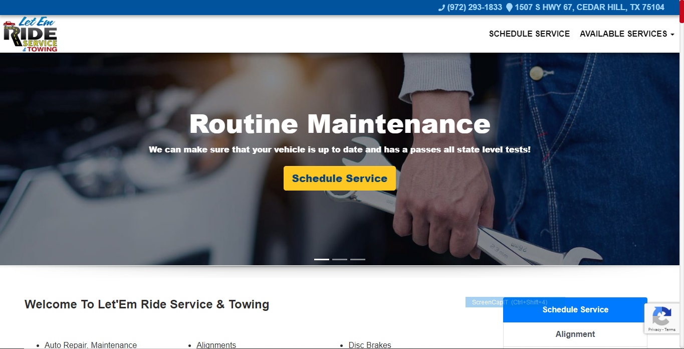
This client using the AutoSTRADA platform wisely incorporates all the colors of their logo in their color scheme. The yellow button with blue text is the focal point and immediately draws the eye to the call-to-action, while the blues and greys denote trust, professionalism, and work ethic.
Purple
Purple is associated with superiority and is often used by brands when they want to seem important or distinguished. Tints of purple like lavender are also associated with creativity and femininity and can, therefore, be used to target female consumers.
Green
Green is predominantly seen as a positive color linked to health, wellness and nature. It is also seen as a strong and bold color. Since green is the color of money, many people associate the color with prosperity or wealth.
In the example below, our client
Guardian Electric and Gas uses green elements as the call to action (button, navigation underline, and contact actions at the top right.) The bright green stands out against the blue and greys of the logo, but indicates environmentalism and energy efficiency.
Magenta
This is widely used to portray youth and/or femininity. It represents hope and offers comfort which makes it a positive color to use in your marketing strategies.
Black
Black is powerful and luxurious. Bold and simplistic, it is often used by high-end fashion brands. Used well, it can portray sophistication, elegance and authority but used in the wrong context it can come off as cold and oppressive.
White
White is modern and simplistic. Executed improperly, it can come across as tacky or lazy but used correctly it looks smooth, sleek and represents cleanliness.
Using color to drive behavior.
In addition to the basic connotations we associate with each color, the way we combine colors will also play a role in driving emotion and behavior.
Contrast.
Using color contrast is one important way we can draw the eye to important elements, such as our call to action. In the example below, our client
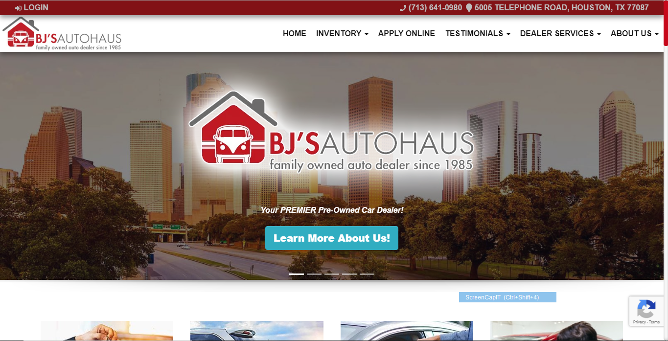
BJ's Autohaus uses a triadic blue to contrast the red and grey of the logo, which helps the button stand out from the rest of the website.
By selecting a color scheme of complementary yet contrasting colors, you can optimize your website for leads. The color grid below shows the different ways to select colors that provide a good balance while allowing certain elements to stand out.
Consistency
Another way to use color to drive the action of your website visitors is through consistency. This falls into two parts. The first is industry standards.
For example, most people know that blue underlined text indicates a link. By following this industry standard, you are helping your website visitors know what action to take.
Secondly, consistency across your site is important. If you are using green as your Call to Action button, you should use the same button color for every action button on your site. This consistency will immediately tell your visitors where they can take action and help them navigate easily through your site.
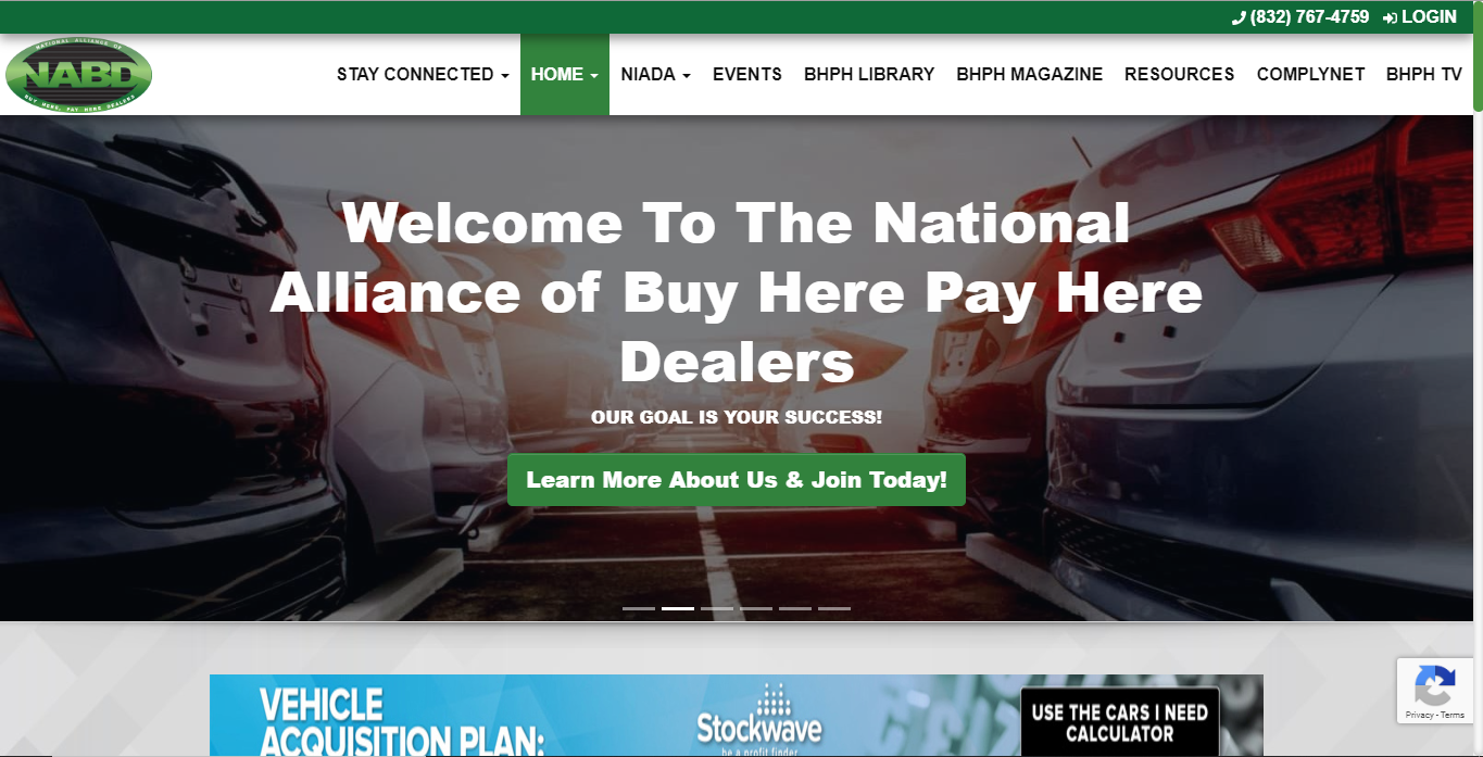
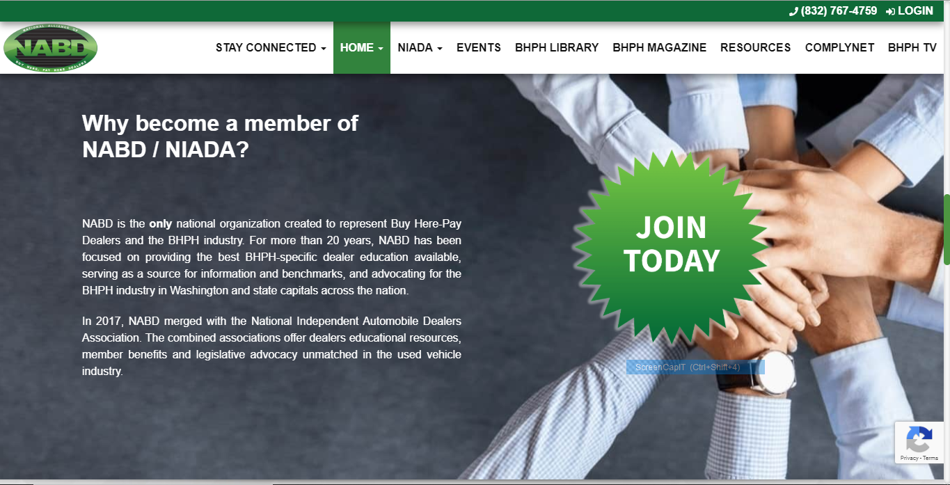
In the site we built for the
NABD, the call-to-action buttons have different sizes and shapes, but all are the same color. This quickly tells visitors where to click to take action.
Header colors, navigation highlighting, and consistency following your color scheme through images and text colors will help create a cohesive look and feel on your site, as well as help visitors know when to take action, and guide them to the information they are looking for.


